Tables
NOTE: In general, tables are not responsive, and not friendly for phones or tablets. As such, tables should be used sparingly, and only to display and organize data and information. Tables should not contain images or graphics.
Insert a Table
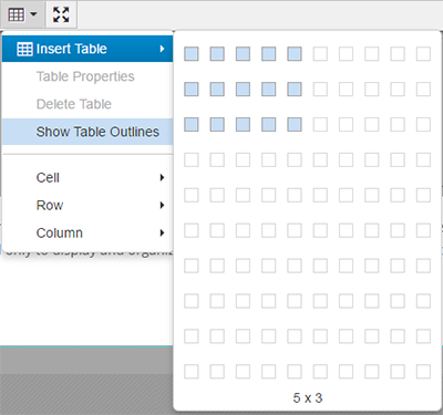
To insert a table, select the "Table" drop-down icon on the toolbar.

Hover over the "Insert Table" option, and select the number of rows and columns desired.

Upon selecting the table size, the table will be automatically inserted onto the page.

Modifying a Table
Table Properties
Once the table is selected, you can click the "Table Properties" option on the Table drop-down menu. Clicking this button will bring up a pop-up box where users can modify the properties of a table.
 Editing the table via the options above (i.e. width, height, cell spacing, cell padding)
does not make the table responsive and easily used on tablet or phone.
Making the Table Responsive
In order to make tables responsive on the site, users need to add/change the class to the table. Under "Table Properties," change the "Class" option to "Custom." In the blank field that appears, type "table", and click "OK".
NOTE: Users can also type "table table-striped" to make the table responsive, with alternating colored rows.
Doing this makes tables more friendly to tablets and phones, but still can be difficult to view. The web team recommends using tables sparingly to avoid the issue.
Delete Table
Clicking the "Delete Table" option deletes the table.
Show Table Outlines
The "Show Table Outlines" icon adds/removes the outlines of tables that would be invisible otherwise, for visual purposes only. These lines disappear when the editable region is saved and the page is viewed in Preview.
Table Cell Options
This menu contains three options, allowing users to edit specific and individual table cells.
- Cell Properties: Brings up a pop-up box similar to the Table Properties pop-up box
- Merge Cells: Merges the selected cells together
- Split Cells: Separates a previously merged cell into its original cells
Table Row Options
The "Table Row Options" allows users to edit specific table rows. This menu contains the following options:
- Insert Row Before
- Insert Row After
- Delete Row
- Row Properties
- Cut Row
- Copy Row
- Paste Row Before
- Paste Row After
Table Column Options
This menu contains three options, allowing users to edit specific table columns.
- Insert Column Before
- Insert Column After
- Delete Column